David Mertz, Gnosis Software
Brad Huntting, University of Colorado
July, 2004
R is rich statistical environment, released as Free Software. It includes a programming language, and interactive shell, and extensive graphing capability. Even beyond that, R comes with a spectacular collection functions for mathematical and statistical manipulations--with still more capabilities available in optional packages.
The emphasis of the R environment is not primarily to be a programming
language per se, but to be interactive tool for exploring data sets,
including the generation of a wide range of graphic representations of
properties of data. Both the generated graphics and the steps taken
during a session can be saved for later usage--especially to pick up
working environments, per project, where you last left off. By
default, R commands are saved in a session history, but you are also
free to save particularly helpful sequences of instructions in R
files that you can source() within a session.
The creators of R describe their goal in "An Introduction to R":
It is recommended that you should use separate working directories for analyses conducted with R. It is quite common for objects with names x and y to be created during an analysis. Names like this are often meaningful in the context of a single analysis, but it can be quite hard to decide what they might be when the several analyses have been conducted in the same directory.
Hidden files are generated in each directory that contain binary serializations of working objects in a session.
The (GPL) R programming language has two parents: the proprietary S/S-PLUS programming language, from which it gets most of its syntax; and the Scheme programming language, from which it gets many (more subtle) semantic aspects. S dates back to 1984 in its earliest incarnation, with later versions (inlcuding S-PLUS) adding many enhancements. Scheme (as Lisp), of course, dates back to days when the hills were young. R emerged as a Free Software superset of S/S-PLUS in 1997, and has had a thriving user and developer community since then. You need not worry about its heritage to benefit from R.
R is available in compiled form for many computer platforms: Linux, Windows, Mac OSX and MacOS Classic. Source is also, naturally, available for compiling to other platforms--for example, coauthor Brad built R to FreeBSD with no difficulties. R suffers some glitches on various platforms: for example, plot output using Quartz on David's Mac OSX machine produces an unresponsive display window; and worse still, on Brad's FreeBSD/AMD Athlon box, exiting R can actually force a reboot (this probably has to do with incorrect SSE kernel options, but the behavior is still troublesome). Nonetheless, R is generally stable, fast, and comes with an absolutely amazing range of statistical and math functions. Optional packages add even further to the huge collection of standard packages and functions.
The basic data object in R is a vector. A number of variants on vectors add capabilities, such as (multi-dimensional) arrays, data frames, (heterogeneous) lists, and matrices. Much like in NumPy/NumArray or Matlab operations on vectors and their siblings operate elementwise on member data. A few quick examples of R in action give the feel for its syntax (shell prompts and responses are included in these initial examples):
> a <- c(3.1, 4.2, 2.7, 4.1)  # Assign with "arrow" rather than "="
> c(3.3, 3.4, 3.8) -> b       # Can also assign pointing right
> assign("c", c(a, 4.0, b))   # Or explicitly to a variable name
> c                           # Concatenation "flattens" arguments
[1] 3.1 4.2 2.7 4.1 4.0 3.3 3.4 3.8
> 1/c                         # Operate on each element of vector
[1] 0.3225806 0.2380952 0.3703704 0.2439024 0.2500000 0.3030303 0.2941176
[8] 0.2631579
> a * b                       # Cycle shorter vector "b" (but warn)
[1] 10.23 14.28 10.26 13.53
Warning message:
longer object length
        is not a multiple of shorter object length in: a * b
> a+1                         # "1" is treated as vector length 1
[1] 4.1 5.2 3.7 5.1
We will see examples of indexing, slicing, named and optional
argument, and other elements of R syntax as we move along. The R shell
prompt--especially if you have GNU readlines installed--is a wonderful
interface for exploration. Keep in mind the help(function) command
to learn more as you work (also spelled ?function). User of the
Python shell will find the R shell immediately familiar--and
appreciate the utility of both.
Coauthor Brad has been collecting temperature data from four thermometers in and around his house for almost a year, and automatically compiling sliding windows of readings into web-accessible graphs using GnuPlot. While such a hackerish data collection may not really serve any broad scientific purpose, it has a number of excellent characteristics that resemble scientific data.
The data is collected every three minutes, which makes for a lot of data points over a year (around 750k between the four measurement sites). Some of the data is missing, because of various failures in either the thermometer, the transmission channel, or the recording computer. In a small number of cases, it is known that the single-wire transmission channel transposes simultaneous readings because of timing errors. In other words, Brad's temperature data looks a lot like real-world scientific data that is pretty good, but still subject to glitches and imperfections.
The temperature data is collected into four separate data files, named by collection site, each having a format like:
2003 07 25 16 04 27.500000
2003 07 25 16 07 27.300000
2003 07 25 16 10 27.300000

A first pass at reading the data might look something like:


> lab <- read.fwf('therm/lab', width=c(17,9))   # Fixed width format
> basement <- read.fwf('therm/basement', width=c(17,9))
> livingroom <- read.fwf('therm/livingroom', width=c(17,9))
> outside <- read.fwf('therm/outside', width=c(17,9))
> l_range <- range(lab[,2]) # Vector of data frame: entire second column
> b_range <- range(basement[,2])    # range() gives min/max
> v_range <- range(livingroom[,2])
> o_range <- range(outside[,2])
> global <- range(b_range, l_range, v_range, o_range)
> global          # Temperature range across all sites
[1] -19.8  32.2
The naive initial data format has some problems. For one thing,
missing data is not explicitly indicated, but is simply marked by an
absent line and time stamp. Moreover, dates are stored in a
non-standard format (rather than ISO8601/W3C), with internal spaces.
As a smaller matter, repeating timestamps in four files is space
inefficient. Certainly we could clean up the data in R itself, but
instead we took the recommendation of the R authors in the document
"R Data Import/Export" (see Resources). Text processing is generally
best done in a language specialized to that task: in our case we wrote
a Python script to generate a unified data file that is
straightforwardly readable using R. For example the first few lines of
the new data file, glarp.temps read:
timestamp      basement     lab     livingroom  outside
2003-07-25T16:04 24.000000      NA     29.800000  27.500000
2003-07-25T16:07 24.000000      NA     29.800000  27.300000
2003-07-25T16:10 24.000000      NA     29.800000  27.300000

Let us work with the improved dataset:


> glarp <- read.table('glarp.temps', header=TRUE, as.is=TRUE)
> timestamps <- strptime(glarp[,1], format="%Y-%m-%dT%H:%M")
> names(glarp)              # What column names were detected?
[1] "timestamp"  "basement"   "lab"        "livingroom" "outside"
> class(glarp[,'basement']) # Kind of data in basement column?
[1] "numeric"
> basement <- glarp[,2]         # index by position
> lab <- glarp[,'lab']          # index by name
> outside <- glarp$outside      # equiv to prior indexing
> livingroom <- glarp$living    # name with unique initial name
> summary(glarp)  # Wonderful built-in to describe most R objects
  timestamp            basement            lab            livingroom
 Length:171349      Min.   :   6.40   Min.   :  -6.40   Min.   :   7.20
 Class :character   1st Qu.:  17.00   1st Qu.:  16.60   1st Qu.:  18.10
 Mode  :character   Median :  19.10   Median :  17.90   Median :  20.30
                    Mean   :  18.88   Mean   :  18.12   Mean   :  20.17
                    3rd Qu.:  20.50   3rd Qu.:  19.50   3rd Qu.:  22.00
                    Max.   :  27.50   Max.   :  25.50   Max.   :  31.30
                    NA's   :1854.00   NA's   :2406.00   NA's   :1855.00
    outside
 Min.   : -19.800
 1st Qu.:   2.100
 Median :   9.800
 Mean   :   9.585
 3rd Qu.:  17.000
 Max.   :  32.200
 NA's   :1858.000
We have seen the range() function: min() and max() find the
individual extremes of a data's range. The summary() obviously also
displays this information, but not in a way directly usable in other
computations. Let us start out by finding a few more very basic
statistical properties of our data:
> mean(basement)        # Mean fails if we include unavailable data
[1] NA
> mean(basement, na.rm=TRUE)
[1] 18.87542
> sd(basement, na.rm=TRUE)  # Standard deviation must also exclude NA
[1] 2.472855
> cor(basement, livingroom, use="all.obs")   # All observations: no go
Error in cor(basement, livingroom, use = "all.obs") :
        missing observations in cov/cor
> cor(basement, livingroom, use="complete.obs")
[1] 0.9513366
> cor(outside, livingroom, use="complete.obs")
[1] 0.6446673
As we would intuitively expect, the two indoor temperatures are more correlated than either is with the outdoors. Still, it is easy to check.
We have seen the mean and standard deviation, and intuitively we might expect temperatures to be distributed normally. Let's check:
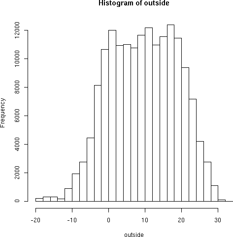
> hist(outside)
Typing in many R commands will pop up a second window with a plot,
chart, or diagram of a data set. Details of how this is done vary with
platform and personal configuration. You may also redirect these
graphics to external files for later use. The above hist() command
produces:
Not bad for a first try. A few parameters can narrow the rounding threshhold:
hist(outside, breaks=1000, border="blue")
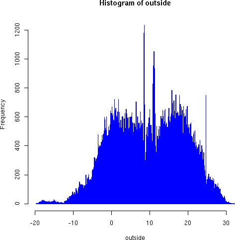
Notice the odd roughness of the dense histogram in the region around 7-12 degrees, with both very high frequency of some measurements, and unexpectedly low frequencies of others. We believe these strong discontinuities indicate a sample bias, perhaps as a result of instrument characteristics. On the other hand, the large but narrow spike around 24 degrees--right around the thermstat-regulated indoor temperature--is more likely to result from the measurment transpositions we mentioned above concerning the instrument transmission channel. In any case, the graphic reveals something interesting to explore and analyze.
A couple more quick variations show indoor temperature distributions:
> hist(livingroom, breaks=40, col="blue", border="red")
> hist(livingroom, breaks=400, border="red")
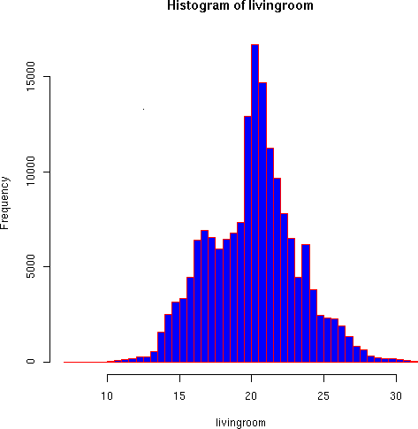
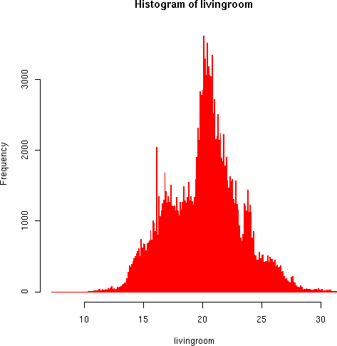
The living room temperature distributions seem more reasonable. Some discontinuities appear in the higher resolution that seem to result from small-scale instrument bias. But the general pattern follows the trimodal distribution we would expect based on Brad's timer-controlled thermastat (large peak around 21, smaller ones around 16 and 24 degrees).
Each measurement site is a linear vector of temperature values. But intuitively, we would expect two primary cycles in the data: daily and yearly (nights and winters are cold).
The first problem we have is turning a 1-D data vector into a 2-D matrix of data points. Then we would like to visualize this 2-D data set:
> oarray <- outside[1:170880] # Need to truncate a few last-day readings
> dim(oarray) <- c(480,356)   # Re-dimension the vector to a 2-D array
> plot(oarray[1,], col="blue", type="l", main="4 p.m. outside temp",
+      xlab="Day of year (starting July 25, 2003)",
+      ylab="Temperature (Celcius)")
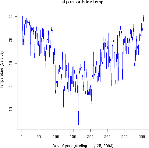
Once we convert the vector into a "Time X Day" matrix (a 2-D array), it is natural to pull off a temperature for each day, and graph the yearly pattern. You could do it otherwise--by extracting every 480th point from the vector; R's way is much more elegant.
What about representing the whole year of temperature measurements. One approach is a color-coded thermal graph:
> x <- 1:480                  # Create X axis indices
> y <- 1:356                  # Create Y axis indices
> z <- oarray[x,y]            # Define z-axis (really same as oarray)
> mycolors <- c(heat.colors(33),topo.colors(21))[54:1]
> image(x,y,z, col=mycolors,
+       main="Outside temperatures near Glarp",
+       xlab="Minutes past 4 p.m",
+       ylab="Days past July 25, 2003" )
> dev2bitmap(file="outside-topo.pdf", type="pdfwrite")
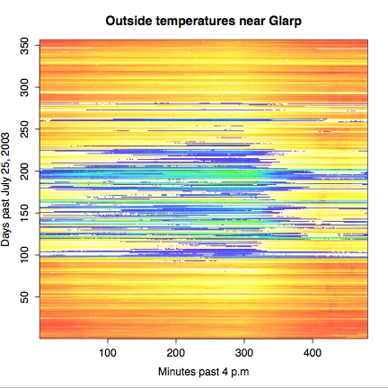
A few comments on what we have done just now. Defining axes and
points is fairly obvious, once you recognize the Python-like slice
notation to create a list of numbers. Indexing by x and y in the
creation of z creates an array of the width and height of the
indices. In this case, z is trivial the same as oarray; but it
would be easy enough to systematically change the values or the
offsets used to reach them. The color map mycolor came from some
trial-and-error: we felt the using reds and yellows was good for "hot"
temperatures (i.e. above 0 degrees Celcius), but it seemed wrong for
cold temperatures. So we concatenate some blues/greens to the color
vector. It turned out we also wanted the colors in the reverse order
to that generated by the standard colormap functions--easy enough with
indexing.
You might notice that the thermal map is drawn a bit more sharply than
were prior graphics. An adequate, but less impressive, image is drawn
on screen by the image() command. Exporting the "current image" to
an external file can often produce better results, as here.
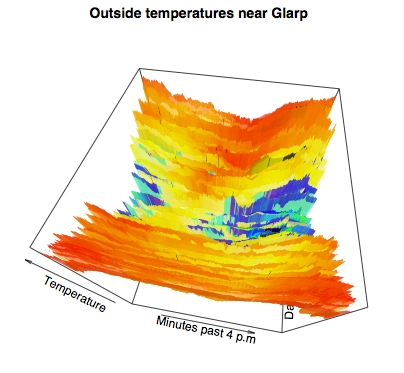
While we personally like the prior flat thermal map, many viewers of graphics might find information better conveyed by pseudo-perspective into three dimensional data. It requires little extra work in R to produce quite stunning perspectival topographic maps of 3-D data. For example:
> persp(x,y,z, theta=10, phi=60, ltheta=40, lphi=30, shade=.1, border=NA,
+       col=mycolors[round(z+20)], d=.5,
+       main="Outside temperatures near Glarp",
+       xlab="Minutes past 4 p.m",
+       ylab="Days past July 25, 2003",
+       zlab="Temperature", )
The few basic statistical analyses and we performed, and the basic plots we generated, in this article only represent a miniscule subset of the statistical capabilities of R. For virtually every field of science, and for virtually every well-known (or even obscurely known) statistical technique, there are either standard functions or extension packages to support the relevant mathematical techniques. Really all we hope to have presented here is a feel for what it is like to work with R.
The authors can see already that R offers many riches that they plan to make use of for a long while into the future.
The home page for the "R Project for Statistical Computing" is:
http://www.r-project.org/
Several readers of my Charming Python column, being Python users, have expressed a particular fondness for the Python binding to R. Actually, there are two of them; RPy lives at:
http://rpy.sourceforge.net/
The older RSPython is also good, but my impression is that the RPy binding is better. RSPython can be found at:
http://www.omegahat.org/RSPython/
Either one of these bindings let you call the full range of R functions transparently from Python code, using Python objects as arguments to the functions.
The R web site contains extensive documentation, everything from tutorials to complete API descriptions. Two tutorials stand out of particular interest to those readers first encountering R:
"An Introduction to R": http://cran.r-project.org/doc/manuals/R-intro.pdf
And:
"R Data Import/Export": http://cran.r-project.org/doc/manuals/R-data.pdf
For what it is worth, on most systems you can launch a browser with
generated HTML pages for R documentation by entering help.start() at
the R command line.
A summary of the history of S annd S-Plus can be found at:
http://cm.bell-labs.com/cm/ms/departments/sia/S/history.html
Something about other stats packages: SPSS, SAS, Matlab, etc.
Coauthor David wrote a Charming Python installment on Numerical Python, which has a similar feel, and many of the same capabilities of R (R is considerably more extensive though):
http://www-106.ibm.com/developerworks/linux/library/l-cpnum.html
To David Mertz, all the world is a stage; and his career is devoted to
providing marginal staging instructions. David may be reached at
[email protected]; his life pored over athttp://gnosis.cx/publish/.
Suggestions and recommendations on this, past, or future, columns are
welcomed. Check out David's book Text Processing in Python at
http//gnosis.cx/TPiP/.
Brad Huntting is a Mathematician completing a Ph.D. at the University of Colorado. You can reach him at [email protected].